Examples
Everything it finds
The home page shows two of these in passing. This is the whole set, with the markup as it stands beside the markup it should be, so you can judge for yourself whether it is worth pointing at your own site.
01
Alt text that describes a different photograph
The one no automated checker on the market will catch, because by every mechanical measure it is correct. This is what the judgement tier is for.
The picture on the page
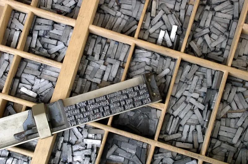

What the page has
<img src="/img/header-2.jpg" alt="Our team at the summer barbecue">Every automated checker on the market calls this a pass. There is an alt attribute, it is not empty, it is not a filename. Nothing flags it — and a screen reader announces a barbecue.
What it should have instead
<img src="/img/header-2.jpg"
     alt="Trays of metal printing type, with a composing
          stick holding a line of set text across them.">
Kithe looks at the actual image and the words around it, and writes this for you to approve, edit or throw out.
It usually happens the same way. Somebody duplicated a page, swapped the picture, and left the old sentence behind. It has been wrong ever since, and nobody who can see the page will ever notice.
02
6 things a rule cannot answer
Every “before” below passes the mechanical checks. That is the whole point — if a rule could catch it, it would never reach a model and would not be on this page.
01
Does the alt text describe this picture?
A rule can see that alt exists. It cannot see the photograph, so it cannot tell you the sentence is about a different one.
What the page has
<img src="/img/header-2.jpg"
     alt="Our team at the summer barbecue">
Passes every checker on the market. Somebody using a screen reader is told this page has a barbecue on it.
What it should have instead
<img src="/img/header-2.jpg"
     alt="Trays of metal printing type, with a composing
          stick holding a line of set text across them.">
Kithe looks at the image and the words around it, then writes this for you to approve.
02
Does the link text work on its own?
“Read more” is caught by a rule because it is a stock phrase. Text that is unique but still says nothing is not, and that is the common case.
What the page has
<a href="/classes/autumn">Details of this term’s
  evening sessions are on the classes page</a>
Unique, descriptive, and thirteen words long. Pulled up in a list of every link on the page, it is a paragraph where a label should be.
What it should have instead
<a href="/classes/autumn">Autumn evening classes</a>Short enough to scan, specific enough to place. Kithe suggests the wording; you keep or change it.
03
Does the heading describe what is under it?
Heading levels are a rule’s business. Whether a heading means anything is not.
What the page has
<h2>More</h2>
<p>Places are limited to eight a term and they
   go quickly, so book before mid-month.</p>
Headings are the table of contents for most screen reader users. “More” sends them back to reading the whole page.
What it should have instead
<h2>Booking and how many places are left</h2>
<p>Places are limited to eight a term and they
   go quickly, so book before mid-month.</p>
Kithe reads the section under the heading and writes one that describes it.
04
Can somebody follow this on the first read?
No rule measures whether a sentence is followable. This one is read once, on a phone, by somebody in a hurry.
What the page has
<p>Enrolment is contingent upon remittance of the
   requisite deposit prior to the commencement
   of the session.</p>
Twenty words, three of them Latinate, and an instruction somebody has to act on.
What it should have instead
<p>Pay the deposit before the first session
   to keep your place.</p>
Same meaning, half the words. Flagged as a judgement rather than a measurement, so it arrives as a draft.
05
Does the button’s name match what it does?
A rule can see that a name is there. Whether it is the right name is a different question, and a confident wrong name is worse than no name at all — it is followed.
<button aria-label="Menu">
  <svg><use href="#icon-share"/></svg>
</button>
Passes every automated checker on the market, because the button has a name. Somebody using a screen reader is told this opens the menu, presses it, and posts the page to social media.
<button aria-label="Share this page">
  <svg><use href="#icon-share"/></svg>
</button>
Kithe reads the icon and the markup around it, notices the name describes a different control, and writes the one it should have.
06
Does the title say which page you are on?
Every page here has a title, so every rule is satisfied on every page. That nine of them are the same title is not something a tool checking one page at a time can ever see.
What the page has
<!-- /classes -->
<title>Riverside Pottery</title>

<!-- /booking -->
<title>Riverside Pottery</title>
Nine tabs open and nine identical labels. The same in a bookmark list, in browser history, and in the results when somebody searches for you.
What it should have instead
<!-- /classes -->
<title>Evening classes — Riverside Pottery</title>

<!-- /booking -->
<title>Book a place — Riverside Pottery</title>
Only a scan that has read the whole site can find this, which is why it is on the plans that crawl one.
One scan, fifty pages
Almost nothing reaches the model
- Elements looked at1,240
- images, links, headings, paragraphs
- Settled by a rule890
- no model request, no cost
- Sent to the model350
- what a rule could not answer
- Came back a problem41
- each with a draft to approve
Why link text is the one people argue about
Because on the page it looks fine. Here is the same page with the sentences taken away, which is how a good number of people move through it.
03
One page, marked up
A small studio’s classes page with six findings ringed and keyed into the margin. Point at any ring, or any note, and the two light up together.
riverside-pottery.ca/classesSpecimen
Autumn classes
Two-hour beginner sessions on the wheel, Thursday evenings from late September. Clay, glazes and firing all included.
More
Places are limited to eight a term and they go quickly, so book before the middle of the month. read more
Term dates, straight to your inbox
Email addressSign up
Enrolment is contingent upon remittance of the requisite deposit prior to the commencement of the session.
Six findings on this page
Highlikely blocking
Button has no accessible name
The icon button at the end of the menu
No text, no aria-label. It is announced as “button” and nothing else — you hear that there is something to press, and nothing about what pressing it does.
<button class="menu"><svg …></svg></button>
Mechanical · WCAG 4.1.2 Name, Role, Value (A)
Highlikely blocking
Image has no alt attribute
The photograph under the menu
A screen reader announces nothing here. If the picture carries meaning, describe it. If it is decoration, give it an empty alt so it is skipped.
<img src="/uploads/IMG_2481.jpeg">
Mechanical · WCAG 1.1.1 Non-text Content (A)
Mediumworth fixing
Heading level skipped
The word “More”, under “Autumn classes”
An h4 straight after an h2. People who navigate by heading read the levels as an outline, and a skipped level reads as a missing section.
<h2>Autumn classes</h2> … <h4>More</h4>
Mechanical · WCAG 1.3.1 Info and Relationships (A)
Mediumworth fixing
Link text does not say where it goes
The link at the end of the paragraph
It reads “read more”. Screen reader users often pull up a list of every link on a page. Out of context this one says nothing at all.
Drafted for youBook a Thursday evening wheel class
Mechanical · WCAG 2.4.4 Link Purpose (A)
Highlikely blocking
Form field has no label
The sign-up field at the foot of the page
You hear the field’s type but not what to put in it. The placeholder is not a label: it disappears the moment anyone types, and plenty of readers skip it.
<input type="email" placeholder="Email address">
Mechanical · WCAG 3.3.2 Labels or Instructions (A)
Lowminor
Notice is hard to read
The line of small print at the very bottom
Long and formal for something people have to act on. This one is a judgement rather than a measurement, so it arrives as a draft you approve or bin.
Drafted for youPay the deposit before the first session to keep your place.
Needs judgement · WCAG 3.1.5 Reading Level (AAA)
Kithe found these. It did not fix them, and it cannot: there is no login to your site and no way to write to it. The drafts above are wording for you to approve, edit or ignore.
04
Every mechanical check, and what it is looking for
Sixteen of them. Each is a fact about the page rather than an opinion, so the answer is the same however many times you run it — and each names the rung it sits on.
01
Controls with edges too faint to findPaidThe fashionable form: a field bordered #eeeeee on white, at 1.18:1. It passes every text-contrast tool on the market because there is no text in it, and somebody with reduced contrast sensitivity cannot see where to click.02
Focus outline removed and not replacedPaidoutline: none is one line and the default ring is ugly, so it is the most common fault in modern CSS. Tab through the page afterwards and something invisible has focus; press Enter and find out what it was.03
A tab order somebody rearranged by handPaidtabindex="1" pulls one element in front of the whole page when tabbing. It is invisible with a mouse, so it survives every round of testing that does not involve a keyboard.04
Hidden from a screen reader, still reachable by keyboardPaidFocus lands on something that, as far as a screen reader is concerned, does not exist. Worse than no markup at all, because it was added on purpose.05
Headings with no textPaidPeople navigate a page by pulling up its list of headings. An empty one is a blank line in that list: a keystroke to skip, and it tells nobody anything.06
Fields that could fill themselves inPaidYour name, your email, your postcode. One attribute lets a browser fill them, and for somebody using a switch or their voice that is the difference between one gesture and forty.07
Images with no alt textNo accountA screen reader has nothing to say about them. Usually the ones you dragged in and never thought about again.08
Colour contrastNo accountMeasured, not guessed: the real ratio between your text and what is behind it, against the 4.5:1 line. Light grey on white is the usual culprit.09
Form fields with no labelNo accountSearch boxes, contact forms, the newsletter signup. A placeholder is not a label — it vanishes the moment anyone types.10
Buttons and icons with no nameNo accountThe menu toggle, the search glyph, the close cross. If it holds an icon and nothing else, there is nothing to announce.11
Heading level skippedFree accountAn h2 followed straight by an h4. People who navigate by heading read the levels as an outline, and a gap reads as a missing section.12
No top-level headingPaidNothing on the page says what the page is. Long posts and docs drift here fast, especially after a theme change.13
Vague link textPaidRead more. Click here. Here. Learn more. Six of them in a list say nothing at all.14
Links with no textFree accountA link wrapped round an unlabelled icon, or round nothing. There is no way to announce where it goes.15
Tables with no headersPaidPricing, comparisons, API references — anything in rows and columns where no cell is marked up as a header.16
Video and audio with no captionsPaidDemos, talks, screen recordings, with no captions track present.17
Frames with no titlePaidAn embedded map, video or form, announced as “frame” and nothing else.18
Pages with no titleNo accountThe title is what a browser tab, a bookmark and a search result all show, and it is the first thing announced when a page loads.19
No language declaredFree accountWithout it, screen reading software has to guess how to pronounce your words. It guesses badly, and English read with a French voice is not readable.20
Duplicate idsPaidThe same id twice on one page. It quietly breaks labels, skip links and in-page anchors.21
Broken linksPaidLinks that error out or go nowhere, checked across every page we reach.22
No skip-to-content linkPaidWithout one, anybody moving by keyboard tabs through your whole menu again on every single page.
How findings are ranked, and how much of the real problem any automated tool can reach, are both set out on the home page.
End
Now try it on yours
Three checks a day, no account, nothing installed. You will know within a minute whether any of this applies to you.